Summary
Key Principles of Web Usability
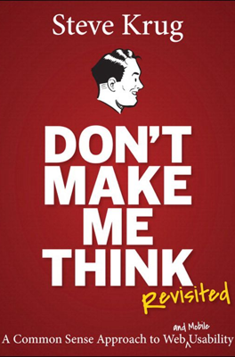
Steve Krug's book, "Don't Make Me Think, Revisited," underlines the imperative of simplicity in web design to enhance usability. Krug articulates several key laws of usability that prioritize user-friendly web interactions.
First Law: Don't Make Me Think! A website should be self-evident, making navigation and comprehension effortless for the user. Sites should avoid making users think unnecessarily and provide a seamless experience where the functionality of elements is obvious.
Second Law: Mindless Choices Enhance User Experience Every interactive choice should be straightforward and clear, thus enhancing the user’s confidence in using the website without fear of getting lost or making errors.
Third Law: Omit Needless Words Focus on clear and concise content that aids usability rather than cluttering the interface. Websites should communicate effectively by stripping down the unnecessary text to improve user interaction.
Real Web Usage and Design Recommendations
Krug points out that real users rarely read web pages thoroughly; instead, they scan them. Optimal web design should accommodate this by facilitating quick scanning and providing clear visual hierarchies and easily identifiable links. This includes using established conventions and a clear visual hierarchy to guide the user's eye naturally through the content.
Enhanced Navigation and Home Page Usability
Effective web navigation mimics the ease of navigating physical spaces like stores, with clear signposting and hierarchical structure, allowing users to find information effortlessly. Similarly, the home page should quickly communicate the site's purpose and provide easy access to content, effectively acting as a portal to the essential parts of the site.
Overcoming Usability Debates
Krug emphasizes usability testing as a crucial element in resolving design debates. By observing real users interacting with the site, design teams can move from subjective opinions to objective decisions that enhance usability. This involves regular, simple, and cost-effective testing strategies that allow for continuous improvements based upon user feedback.
Mobile Usability and Accessibility
The shift towards mobile has introduced unique design challenges. Krug insists on a mobile-first approach, where priority is given to essential functionalities, aligning with the limitations and advantages of smaller screens. Furthermore, accessibility should be integrated into usability to serve all users effectively, promoting inclusivity.
Usability as an Ethical Practice
Lastly, Krugg explores the ethical dimensions of usability. Web designers should aim to increase user satisfaction and promote loyalty by respecting users, not misleading them or exploiting psychological vulnerabilities.
By adhering to these principles, designers and developers can create web experiences that are not only effective and efficient but also respectful and inclusive of all users.
Per-chapter summary
- Don’t Make Me Think!
- How We Really Use the Web
- Billboard Design 101
- Animal, Vegetable, or Mineral?
- Omit Needless Words
- Street Signs and Breadcrumbs
- The Big Bang Theory of Web Design
- “The Farmer and the Cowman Should Be Friends”
- Usability Testing on 10 Cents a Day
- Mobile: It’s Not Just a City in Alabama Anymore
- Usability as Common Courtesy
- Accessibility and You
- Guide for the Perplexed
